Digital storefronts are landing pages of Shopify. This is what catches the visitor’s eye, keeps them on your site, and begins their purchase experience.
Landing pages of Shopify are designed to convert potential consumers by providing accurate and simple content that makes the value proposition evident.
The best landing pages can help you generate more leads, increase conversion rates, and improve your entire marketing efforts.
In this article, you’ll get the best Tips to create perfect Landing Pages for Your Shopify Store.
What is a landing page for Shopify?
A separate web page created specifically for marketing purposes is known as a landing page for Shopify. This is the page that a visitor sees after clicking on a link, such as a Google ad or a promotion in an email campaign.
Landing pages of Shopify stores have a specific goal in mind: to attract customers to do a specific task. In the case of ecommerce, this essentially entails making a purchase.
The website is tailored to the buyer’s needs, and customers are encouraged to take action with a simple call to action (CTA). Engaging headlines, high-quality photos, brief prose, and social proof pieces make up the page content.
To further understand the purpose and functionality of ecommerce landing pages, consider the following hypothetical situation.
A customer may be planning a trip and wants to buy new luggage, so they look for “best moisturizing lotion” on Google. They click on a link in the search results titled “The Perfect Lotion for Your Skin.”
They see a headline that fits the ad and photos of the best lotions when they arrive on the page. There’s also a call-to-action button that offers a 30% discount code. Subheadings on the page stress the lotion’s extra benefits, as well as a money-back guarantee and client testimonials.
The shopper was able to find exactly what they were looking for in a matter of seconds in this case. The website’s wording matched the consumer profile, included important product attributes, established trust, and made it simple for the shopper to purchase. As a result, a site visitor turned into a potential buyer.
“This is the purpose of landing pages: that should able to convert visitors into buyers”.
Shopify Landing Pages vs. Product Pages: What's the Difference?
Before diving into the details of Shopify landing pages, it’s vital to understand how they differ from other pages on your site, as well as the implications for your conversion rate optimization efforts.
Landing Pages for Shopify:
- There is only one clear CTA in this section.
- Additional paths, such as site navigation, are removed.
- Content is written with a single aim in mind and for specific audiences.
- Not necessarily SEO-optimized, but for marketing initiatives.
Product pages for Shopify:
- It has a distinct CTA, but it can also have many CTAs.
- Additional paths, such as site navigation and product categories, are available.
- Content that is written for the general public.
- Product descriptions and suggestions are included.
- SEO-optimized to bring in organic visitors.
Regardless of their distinctions, both product pages and landing pages are essential to your website’s success. However, when it comes to your total marketing activities, they serve various objectives.
If you want to make your product page more trustworthy get a WhatsApp review collection app that can easily build social proof.
Try following Best Practices When Creating Landing Pages
Every page you make will be designed for specific advertising campaigns, consumer segments, and sales funnels. However, several recommended practices for ecommerce landing pages have been proved to work across the board.
The following are some of the must try strategies: Just go through it.
1.Include a clear and visible call to action
Visitors should understand your offer and how they can take advantage of it as soon as they arrive on your page.
Landing pages, unlike other pages on your site, should only contain one call to action. Giving visitors only one option simplifies their decision-making process significantly instead of requiring them to weigh multiple possibilities and make a decision.
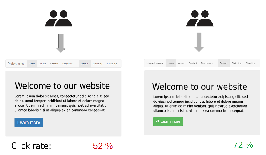
This moves visitors through the sales funnel faster and with fewer distractions, which is perfect for conversions.
The call to action should be widely displayed, easily accessible, and targeted at certain customers. This can be implemented by:
- Your CTA should be at the top of the page, above the fold.
- Throughout the website, there are several buttons for a single CTA.
- When writing button text, use the active voice (i.e. Sign up for Free)
- Impart a sense of urgency or exclusivity in your audience.
Landing pages, as previously stated, are excellent for testing. This is especially for your call to action. Even the tiniest adjustments can have a significant impact. So be aware about it.
“You should test numerous CTA elements on a regular basis, such as eye-catching button structure, button location, button colour, and so on”
2.Make use of high-resolution images
Images are important because you only have so much time and space on landing pages to persuade visitors. After all, isn’t it true that a picture is worth a thousand words?
Use high-resolution photos that are relevant to the landing page’s goal. Product photos, for example, would be great if the page is focused on mid-funnel advertising for specific items. In addition, make sure that your photos are mobile-friendly. Mobile, in particular, is growing more popular for ecommerce purchases. Without having to zoom out or scroll down, images should fit neatly on the phone.
Images not only provide visual appeal but also aid in the development of trust and trustworthiness. Only use photos that will help your landing page to stand out. Pixelated images, have bad lighting or don’t fit with the content should be removed.
3.Keep the clutter to a minimum.
A great landing page is simple and easy to navigate. This process converts your page as clutter-free as possible.
You don’t want to lose a conversion because your visitor was confused by too much material or couldn’t find the “Buy Now” button.
The following are some suggestions for reducing clutter:
- Headlines that are brief and to-the-point
- CTA that is clear and visible
- Site navigation links are being removed from the site.
- Images that are both relevant and of good quality
- For product specifics, use bullet points.
Remember that a visitor’s decision to stay or leave your site can be made in a matter of seconds. This implies they’re unlikely to sit and read the entire page, especially if it’s long. Avoid filler and don’t add content just for its sake; stick to the value proposition.
4.Add reliable Testimonials
When selling on Shopify, credibility is vital, which is why we recommend including testimonials from influential people on your client’s landing page. Ideally, they should be happy clients of your client’s company, who can subsequently provide favourable feedback about how fantastic their product or service was. Conversion rates will improve as a result of these changes.
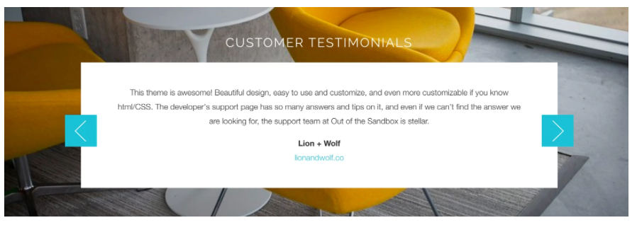
The testimonials area of the Retina theme has a full-width slideshow-style layout with a stationary background colour or picture and scrollable testimonials on top. There’s also a “transparency” feature that enables a semi-transparent background on the text area, which is a wonderful technique to make your testimonials more clear if you want to remove background image clutter.
5.Consider making the concept of Scarcity
Scarcity on your landing pages might help you increase purchases and decrease cart abandonment.
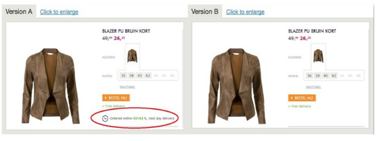
Not sure how to make the most of it? Adding time constraints to your sales or offers is a perfect example. This communicates to the visitor that what you’re selling is valuable and won’t last forever. If the visitor does not act now, they may never have another opportunity.
Consider the case of an online store that compared a version with a limited next-day shipping offer to a version without the offer.
6.Maintain Consistency in Your Design
Creating distinct designs at different stages of the sales journey is a common blunder made by eCommerce businesses.
For example, if a user arrives at your landing page via an email campaign, they should recognise the path they took previously. This means that the entire sales experience should be frictionless from the minute a user opens an email to the time they click “Order.” Generate email campaigns or Facebook advertising that perfectly match your landing page to create a sense of comfort and familiarity. Colours, typography, copy, and imagery are all examples of this.
7.Directional cues
On a landing page, directional cues can include arrows or even people looking in a specific direction. In addition, they provide site visitors that extra push to convert by completing the activity via the call to action button.
8.A/B testing should be carried out forever.
You’re mistaken if you assume your Shopify landing page is finished once it’s up. You’ll be wasting a lot of money if you don’t continue to A/B test this page to see what works best. A/B testing (also known as split testing) is an experiment in which you try out multiple variations of a landing page simultaneously.
Are you confused as to selecting photographs to use? They should be put through an A/B test.
Are you unsure which CTA is best for which audience? That is a question that data can answer for you.
Shopify landing pages that haven’t been tested aren’t taking advantage of the data available. As a result, they aren’t getting the sales that they should be.
The easiest way to track outcomes and monitor where/how conversion rates rise is to keep doing A/B tests. It’s also the most effective technique to create a very effective landing page.
On your landing page, A/B test the following elements:
- Headline
- Images
- Directional cues
- CTA button design and colour
What is everyone's go-to landing page solution?
Shogun: It is a Shopify landing page builder: To develop, measure, and improve your Shopify pages, here’s a simple yet comprehensive ecommerce landing page tool. There is no need to code.
GemPages: GemPages is a drag-and-drop landing page builder for Shopify stores that is inexpensive and feature-rich. There’s no need to know how to code here, either. It’s also mobile-friendly, so it adjusts your online store to the size of your potential customers’ screens.
Zipify :Zipify isn’t the cheapest of the Shopify landing page builders, but it comes with a slew of features to justify its price. They share what they’ve learnt from running their own profitable online store with other Shopify retailers.
PageFly: This Shopify software appears to outperform GemPages and could be your choice Shogun replacement for creating high-quality Shopify landing pages.
Hypervisual: Hypervisual, as its name suggests, focuses on creating visually appealing pages that make your landing page stand out. You can use various design elements for each page or product you have, for example.
Final thoughts
When it comes to your store’s success in the eCommerce market, effective Shopify landing pages are critical. The good news is that they’re rather straightforward to make with the appropriate above instructions and tools.
Best of luck!


Leave A Comment?